
September 19, 2026
Preventing Color Shift in Re-Runs: Managing CMYK Delta E Tolerances for Multi-Batch Book Printing
I have been involved in book production and print procurement for over a decade, and I can tell you that the most painful conversation in this business is not about the first print run. It is about the fifth. The first print run ships, the book sells, the publisher orders a reprint, and then the phone calls start. The cover color on the new batch does not match the first batch. The spine looks a shade darker. The interior text pages that were supposed to be the same warm cream now read as a cooler grey.
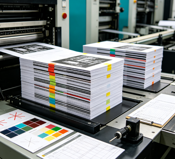
1. Introduction: The Reprint Problem Nobody Budgets For
I have been involved in book production and print procurement for over a decade, and I can tell you that the most painful conversation in this business is not about the first print run. It is about the fifth. The first print run ships, the book sells, the publisher orders a reprint, and then the phone calls start. The cover color on the new batch does not match the first batch. The spine looks a shade darker. The interior text pages that were supposed to be the same warm cream now read as a cooler grey.
This is not a quality failure in the traditional sense. The printer followed the spec. The ink was the same formula. But something drifted — and that something is almost always a Delta E tolerance issue that was never properly quantified, measured, or written into the purchase order.
Here is the uncomfortable truth: most book printing contracts specify color using subjective language. “Match the approved proof.” “Consistent with the first printing.” “No visible color shift.” None of these are measurable. None of them survive the second production run, let alone the sixth.
What you need instead is a numerically defined Delta E tolerance, referenced to a recognized standard, with a written measurement protocol that both parties agree to before the first sheet goes on press. This guide walks through the standards, the metrics, and the practical controls that make multi-batch color consistency achievable.
2. Why Color Shifts Between Print Runs — The Real Causes
Before we get into tolerances, it helps to understand what actually causes color to drift between batches. In my experience, the causes fall into four categories, and only one of them is genuinely “the printer’s fault.”
Ink formulation drift is the first and most common cause. Ink manufacturers produce in batches, and even with the same pigment supplier, the raw pigment dispersion can vary slightly from lot to lot. A 2% shift in pigment concentration is invisible in a single batch but becomes visible when you compare a fifth reprint against the first. Studies on batch-to-batch variation in gravure inks and paper substrates have shown that spot color accuracy can degrade significantly despite identical ink formulations.
Substrate variation is the second cause, and it is the one publishers most often overlook. Paper is a natural product. Coated stocks vary in coating weight and gloss. Uncoated stocks vary in fiber composition and internal sizing. Even different production lots from the same mill can absorb ink differently and read as different colors under the same lighting. When you switch paper lots between print runs — and most publishers do, unless they explicitly reserve stock — you introduce a color variable that no press adjustment can fully compensate for.
Press condition and calibration is the third cause. A press that was calibrated six months ago may have drifted in ink density, dot gain, or registration. The 2026 study on ISO 12647-2 implementation found that presses operating without regular linearization and characterization can see dot gain fluctuations of ±5–8%, compared to ±2% for calibrated lines. That variation propagates directly into color.
Environmental conditions are the fourth cause, and they are often the most insidious. Temperature and humidity affect ink viscosity, paper moisture content, and drying speed. A print run in July, when the pressroom humidity is 65%, will not produce the same result as a run in January at 35% RH. This is why serious book printers specify environmental control of 23±2°C and 50±5% RH as part of their production standard.
3. Delta E 2000 vs. Delta E*ab: Which Metric Are You Actually Specifying?
This is where a lot of specifications fall apart. Delta E is not one number. It is a family of color difference metrics, and the choice of metric determines what the tolerance number actually means.
CIELAB Delta E (ΔE*ab) is the original metric, defined in 1976. It calculates color difference as the Euclidean distance between two points in the L*a*b* color space. It is simple, widely understood, and still referenced in many legacy specifications. But it has a well-documented flaw: the L*a*b* space is not perceptually uniform. Equal numerical distances do not correspond to equal visual differences. A ΔEab of 5 in the blue region looks much more noticeable than a ΔEab of 5 in the yellow region.
CIEDE2000 (ΔE00) is the modern metric, published in 2000 and increasingly adopted in international standards. It applies corrections for lightness, chroma, and hue to produce a metric that correlates far more closely with human visual perception. ISO 12647-2:2013 was the first revision of the offset printing standard to include ΔE00 as the tolerance metric, specifically because ΔE*ab lacked visual uniformity.
The practical consequence is that you cannot directly compare a ΔEab tolerance to a ΔE00 tolerance. The numbers are not interchangeable. Research has shown that a ΔEab tolerance of 5 corresponds to a ΔE00 range of approximately 0.95 to 6.42, with an average of 3.30 ΔE00. In other words, a “ΔE 5” specification means very different things depending on which metric the printer is using.
For book printing, my recommendation is unambiguous: specify in ΔE00, and state that explicitly in the purchase order. If your printer’s measurement software defaults to ΔE*ab, require them to switch the calculation setting. The difference is not academic — it is the difference between a tolerance that predicts what the reader will actually see and one that does not.
4. ISO 12647-2 Tolerances for CMYK Solids: What the Standard Actually Says
ISO 12647-2 is the international standard for process control in offset lithographic printing. It defines targets and tolerances for paper whiteness, ink density, dot gain, and color difference. If you are specifying CMYK book printing, this is the framework your tolerances should reference.
The standard has evolved across three major revisions. The 1996 edition used ΔEab. The 2004 revision adjusted the magnitude of the ΔEab tolerances. The 2013 revision introduced ΔE00 and set the CMYK solid color tolerance at ΔE00 ≤ 3.0 for CMY and ΔE00 ≤ 5.0 for black — though research has shown that this asymmetric tolerance produces unequal pass rates, and that using an equal-pass approach, black does not need a wider tolerance than cyan or magenta.
For gray balance, the standard is tighter. The 2013 edition specifies ΔE00 ≤ 2.0 for gray balance, and the proposed 2026 update tightens this further to ΔE00 ≤ 1.5. Gray balance is critical for book interiors because neutral tones — body text, background tints, duotone images — are where color shift becomes most visible. A red-shifted gray is immediately noticeable to a reader even if the individual CMYK solids are within tolerance.
There is one more critical detail in the standard that specifiers often miss. ISO 12647-2 specifies both a deviation tolerance — the allowable difference between the measured value and the aim — and a variation tolerance — the allowable difference between multiple measurements within the same run. The deviation tolerance for CMYK solids in the 2004 edition was ΔEab ≤ 5. The variation tolerance was ΔEab ≤ 4. A printing run that meets the deviation tolerance but exceeds the variation tolerance will still show visible color variation across the sheet.
For multi-batch book printing, the variation tolerance is arguably more important than the deviation tolerance. You are not just matching the aim color. You are matching the previous batch’s color, which may itself have been within deviation tolerance but at the edge of the range.
5. Head-to-Head: Delta E Tolerance Comparison Across Printing Categories
The table below consolidates the tolerance ranges that apply across different printing categories, from international standards to industry practice. This is the reference I use when helping clients set specifications.
Printing Category | ΔE00 Tolerance (Solids) | ΔE00 Tolerance (Gray Balance) | Notes / Source |
ISO 12647-2:2013 (offset) | ≤ 3.0 CMY; ≤ 5.0 Black | ≤ 2.0 | International standard; black tolerance asymmetry noted in research |
ISO 12647-2:2026 update (proposed) | ≤ 3.0 (unchanged) | ≤ 1.5 (tightened) | Gray balance tolerance reduced from 2.0 to 1.5 |
FOGRA PSO certification | ≤ 3.0 average across all colors | ≤ 2.0 | European certification; average, not maximum |
General commercial printing | ≤ 3.0 | — | Industry norm for acceptable color |
Publication printing (books, magazines) | ≤ 7.0 (per ISO/TS 15311-2) | — | Broader tolerance for publications; but publishers often demand ≤ 3.0 |
High-end commercial / luxury books | ≤ 3.5 | — | ISO/TS 15311-2 category |
Brand / spot color (Pantone) | ≤ 2.0 | — | Typical brand requirement |
Critical brand colors | ≤ 1.5 | — | Premium standard; achievable with calibrated workflow |
Lab-grade precision | ≤ 0.5–1.0 | — | Art books, high-fidelity reproductions |
Sources: ISO 12647-2:2013, ISO/TS 15311-2:2018, FOGRA PSO certification data, industry practice
Here is what this table tells you in plain English.
Publication printing standards are looser than what publishers actually want. ISO/TS 15311-2 allows ΔE00 ≤ 7.0 for publications, but any publisher who has received a reprint that visibly shifted knows that 7.0 is far too generous for a book that will sit next to its first edition on the same shelf. The practical target for multi-batch book printing is ΔE00 ≤ 3.0 for CMYK solids and ≤ 2.0 for gray balance, aligning with the ISO 12647-2 offset standard rather than the looser publication tolerance.
Brand and spot colors require tighter control. If your book cover uses a Pantone brand color, a ΔE00 of 3.0 is not acceptable. Brand colors need ≤ 2.0, and premium brands target ≤ 1.5. The reason is contrast: brand colors are seen in isolation and in comparison with the brand’s other materials, where even small shifts are noticeable.
Gray balance is the silent failure point. Book interiors are predominantly neutral. Body text, background tints, and duotone images all rely on accurate gray balance. A ΔE00 of 2.0 on gray balance — the ISO 12647-2 standard — is the minimum acceptable. For premium books, ≤ 1.5 is the target.
6. Building a Multi-Batch Color Control Protocol
Knowing the tolerances is not enough. You need a protocol that makes them enforceable across production runs that may be separated by months or years. Here is the framework I recommend.
Step 1: Establish a physical master sample. The first print run should produce a signed master sample, measured under D50 lighting with a spectrophotometer, with the L*a*b* values recorded for every critical color. This master sample becomes the contractual reference for all subsequent reprints. It should be stored in a controlled environment — not in a filing cabinet in a warehouse.
Step 2: Specify the measurement conditions in the purchase order. The tolerance is meaningless without the measurement conditions. Specify the standard illuminant (D50), the observer angle (2° or 10°), the measurement geometry (0°/45° or d/8°), and the instrument class. ISO 12647-2 references D50 as the standard viewing condition for offset printing.
Step 3: Require ΔE00 reporting on every batch. Do not accept “the color looks fine.” Require a spectrophotometric report for each production batch, showing the measured L*a*b* and calculated ΔE00 against the master sample for each CMYK solid and for the gray balance patch. If the printer cannot provide this, they are not set up for multi-batch consistency.
Step 4: Specify the ink batch and paper lot. For reprints, request that the same ink formulation batch and the same paper production lot be reserved if possible. If the original ink batch is no longer available, require the printer to perform a formulation adjustment against the master sample and verify with a proof before production. Research on batch-to-batch variation in inks and substrates has shown that formulation correction can reduce color reproduction error from ΔE 2.05 to 0.97 when properly implemented.
Step 5: Control the pressroom environment. Specify temperature and humidity limits — 23±2°C and 50±5% RH is the common standard — and require that these conditions be maintained throughout the run. Environmental drift is one of the most controllable causes of color shift, but only if it is written into the specification.
Step 6: Build a color data archive. For every production run, archive the ICC profile, the paper batch number, the ink batch number, and the L*a*b* measurement report. This archive is the only reliable basis for troubleshooting a future color shift, and it is the evidence you need if a dispute arises.
7. The Three Process Variables That Cause the Most Drift
In my experience, three process variables account for the majority of multi-batch color problems in book printing.
Dot gain (TVI) is the first. Dot gain is the difference between the dot size on the plate and the dot size on the printed sheet. It varies with ink, paper, press condition, and environmental humidity. A press running at 8% dot gain on Monday and 5% dot gain on Thursday will produce visibly different midtones and quarter-tones, even if the solid ink density is identical. ISO 12647-2 specifies dot gain targets for different paper types, and a calibrated press should hold within ±2% of target. If your printer cannot provide TVI data, they are not controlling the variable that matters most for tonal reproduction.
Ink density is the second. ISO 12647-2 specifies solid ink density targets for each CMYK color, typically with a tolerance of ±0.07. This tolerance is surprisingly tight — a 0.07 density variation in cyan produces a visible color shift in the midtones and a measurable ΔE shift in the solids. The control loop for ink density is the press operator adjusting ink keys, and the consistency of that loop depends on how frequently the operator measures and how well the press responds.
Gray balance is the third, and it is the one that book publishers should care about most. Gray balance is the combination of CMY dot percentages that produces a neutral gray under standard viewing conditions. A 50% gray balance patch that is 2% over on magenta and 2% under on cyan will read as a warm gray. Across an entire book interior, that warmth becomes a visible characteristic of the edition. The 2026 ISO update’s tightening of gray balance tolerance from ΔE00 ≤ 2.0 to ≤ 1.5 reflects the industry’s recognition that gray balance is where multi-batch inconsistency shows up first.
8. Case Study: Printer Trento’s Inline Color Control on Book Production
The most instructive real-world example of multi-batch color control in book printing comes from Printer Trento, one of Central Europe’s largest book producers.
Printer Trento runs five large-format Rapida presses from Koenig & Bauer, producing approximately 15 million books per year for renowned publishers. The company’s clients include art and architecture publishers whose books are judged on the fidelity of color reproduction — not just the accuracy of individual images, but the consistency of color across an entire edition, and across reprints.
The problem Printer Trento needed to solve was not color accuracy in isolation. It was color consistency at production speed. With large-format presses running at high throughput, a color shift that goes undetected for even a few hundred sheets produces thousands of books that will not match the approved standard.
The solution was an inline spectrophotometric measurement system integrated directly into the press. The QualiTronic system measures color values on every printed sheet at full production speed. The data is displayed on a separate expert monitor at a color inspection desk, giving the press operator immediate visual feedback on several parameters: the visual Delta E between the current sheet and the previous sheet, dot gain at the 40% and 80% halftone points, and a traffic-light indicator showing whether color values are within specification or drifting out of tolerance.
What makes this case study relevant for book publishers is not the specific equipment. It is the principle. Multi-batch color consistency requires real-time measurement, not end-of-run inspection. If you only measure color after the run is complete, you have already printed the entire batch. If you measure inline, you catch drift while there is still time to correct it.
Printer Trento’s clients include publishers who require reprints that match the original edition. The inline system gives the printer the data to prove that consistency — not just claim it. For a publisher ordering a fifth reprint of an art book, that proof is the difference between confidence and anxiety.
9. Practical Sourcing Checklist for Print Buyers and Publishers
If you are sourcing multi-batch book printing and need to prevent color shift, here is the checklist I use.
Before the first print run:
Define the critical colors: which CMYK solids, spot colors, and gray balance patches matter most?
Specify the tolerance in ΔE00, with the metric and measurement conditions stated explicitly.
Require a signed master sample with recorded L*a*b* values under D50 lighting.
Confirm the printer’s press calibration status — dot gain within ±2% of ISO 12647-2 target.
Specify environmental conditions (23±2°C, 50±5% RH) for the pressroom.
Request the ICC profile that will be used for the job.
During production:
Require inline or frequent spectrophotometric measurement, not visual inspection alone.
Monitor gray balance, not just CMYK solids.
Record the ink batch number and paper lot number.
For every reprint:
Compare the reprint proof against the master sample, not against the previous reprint.
Require a formulation adjustment if the original ink batch is unavailable.
Verify that the paper lot is the same or equivalent to the original.
Archive the L*a*b* measurement report with the batch documentation.
Questions to ask your printer:
What Delta E metric do you report — ΔE*ab or ΔE00?
Can you provide inline spectrophotometric measurement data for the run?
What is your gray balance tolerance?
How do you handle reprints when the original ink batch is no longer available?
Can you archive the ICC profile and measurement data for future reference?
10. Frequently Asked Questions
Q: What Delta E tolerance should I specify for book reprints?
For CMYK solids, specify ΔE00 ≤ 3.0 for CMY and ≤ 3.0–5.0 for black, aligned with ISO 12647-2:2013. For gray balance, specify ΔE00 ≤ 2.0. If the book includes brand or spot colors, tighten the tolerance to ΔE00 ≤ 2.0 for those specific colors. State the metric explicitly — ΔE*ab and ΔE00 are not interchangeable.
Q: Why is gray balance more important than CMYK solids for book interiors?
Book interiors are predominantly neutral tones — body text, background tints, and duotone images. A shift in gray balance changes the perceived warmth or coolness of the entire page. A 2% over-print of magenta in a gray balance patch will read as a warm gray, and across hundreds of pages, that warmth becomes a visible characteristic of the edition. CMYK solid tolerances may be within spec while gray balance is visibly off.
Q: Can a printer match a reprint exactly to the first edition?
Not exactly, but they can get close. The target should be ΔE00 ≤ 3.0 for CMYK solids and ≤ 2.0 for gray balance. Achieving this requires a master sample, a calibrated press, consistent ink and paper, and spectrophotometric verification. Without these controls, a reprint can drift to ΔE00 5.0 or higher, which is clearly visible in side-by-side comparison.
Q: What is the difference between ΔE*ab and ΔE00, and does it matter for book printing?
ΔEab is the original 1976 metric. ΔE00 (CIEDE2000) applies perceptual corrections and correlates better with what the human eye actually sees. The numbers are not directly comparable — a ΔEab of 5 corresponds to an average ΔE00 of approximately 3.3. For book printing, ΔE00 is the correct metric to specify because it predicts visual consistency more accurately. ISO 12647-2:2013 adopted ΔE00 for this reason.
Q: How do I verify that my printer is actually holding the color tolerance?
Require a spectrophotometric measurement report for every batch, showing L*a*b* values and calculated ΔE00 against the master sample. If the printer cannot provide this data, they are not set up for multi-batch consistency. A visual “looks good” inspection is not verification.
Q: Does the ISO 12647-2 tolerance apply to digital book printing?
ISO 12647-2 is specifically for offset lithography. Digital printing has its own tolerance framework, though the Delta E concepts and measurement protocols are the same. For digital book printing, specify ΔE00 tolerances based on the digital press manufacturer’s capabilities, but do not assume they match offset standards. Digital presses can achieve excellent consistency, but the tolerance must be verified per device.
11. Final Thoughts
Let me leave you with this.
The color shift problem in multi-batch book printing is not a mystery. It is a predictable consequence of unspecified tolerances, unmeasured process variables, and the natural variation that exists in inks, paper, and press conditions. The solution is not a better printer or a more expensive paper. It is a measurement protocol that turns color from a subjective conversation into an engineering specification.
The numbers are established. ISO 12647-2 defines ΔE00 ≤ 3.0 for CMYK solids and ≤ 2.0 for gray balance. The 2026 update tightens gray balance to ≤ 1.5. Delta E00 correlates with human perception; ΔE*ab does not. And the difference between a specification that references these metrics and one that says “match the proof” is the difference between a fifth reprint that sits seamlessly on the shelf and one that generates a complaint.